CDO AI Forum – Chicago – Westin Chicago River North – June 22, 2026 Join top AI and Data leaders in Chicago to explore the strategies, governance, and innovations driving enterprise performance. Connect, learn, and gain actionable insights — reserve your seat today.
The State of AI Reliability: Why Trust Is Becoming the Biggest Barrier to Scaling AI AI adoption is accelerating across the enterprise, but reliability is lagging. In a new research report, The State of AI Reliability: Perspectives from Data & AI Leaders, CDO Magazine, in partnership...
CDO Magazine Announces the Top 30 Healthcare Innovators 2026 Across healthcare, AI has moved from experimentation to enterprise execution. CDO Magazine recognizes the Top 30 Healthcare Innovators 2026 who are turning that shift into measurable impact. This year...
Opinion & Analysis
Visual Dashboards Aren’t Optimal for Analysis — Here Are 3 Compelling Reasons Why
Written by: Chaitanya Indukuri | Product Manager at Deutsche Bank
Updated 1:26 PM EDT, April 18, 2024

All organizations are trying to be data-driven. While leveraging AI/ML is critical for that goal, a more foundational capability for an organization to be data-driven is enabling business users to view and analyze data easily. For users with high business acumen, being able to analyze or consume analysis is key for translating the analysis into real actionable business insights.
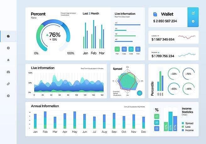
The senior management relies on visual dashboards to assess the performance of their organizations. Visual dashboards are an important tool for organizations as they give a quick snapshot of performance. However, when business users want to do deeper analysis, visual dashboards may not be ideal. Below is an example of a Visual dashboard.
In this two-part article series, I will be critiquing the overuse of such visual dashboards within organizations even for unsuitable use cases.
I am going to classify the use cases where business users interact with data in an enterprise as: “Monitoring,” where business users monitor the performance measures; “Analysis,” where users analyze the business performance to gain insights, and “Sharing of analysis and Insights,” where analysis is communicated to the business stakeholders for taking actions.
Each data visualization use case, its typical user base, and the effectiveness of visual dashboards as a solution for each of the use cases are illustrated in the picture below:
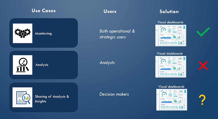
Visual dashboards are the best for monitoring performance but are inadequate for performance analysis. So, what exactly do I mean by analysis?
Analysis typically involves visualizing all the performance measures, comparing performance, and breaking down any performance measure into the lowest granularity possible. In addition, deeper analysis capabilities include identifying performance outliers, forecasting performance, and identifying the drivers of performance via correlation analysis, etc.
Organizations tend to become more data-driven if such deep analysis capabilities are in the hands of business users who do not always have the technical skills to code. In this article, I will be giving a detailed rationale as to why visual dashboards are not ideal for such deeper analysis use cases.
In the next article, I will be offering an alternate paradigm for enabling visual analysis that does not rely on visual dashboards. While visualizations are essential, a narrative is needed along with it to effectively communicate and share analysis and insights. This use case is not in the scope of this article series.
Let us understand why dashboards are not ideal for analysis.
Key challenges of visual dashboards:
1. Visual Dashboards show only a limited set of measures
We are in the era of big data where more and more metrics are available for analysis. However, Visual Dashboards can only visualize a limited number of measures. So, why can visual dashboards hold only limited measures?
This is because visual dashboards consist of graphical visualizations that take up too much space compared to tabular views. In the visualizations below, compare the visualization of the same measure in a tabular heatmap and a histogram.
Tabular heatmap with Sparkline:

Histogram:
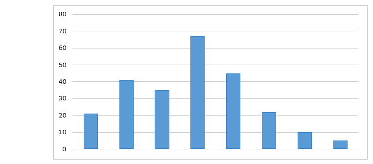
Notice that a histogram is easier to read but the screen real estate it occupies is ~ 10 times more than a tabular heatmap for the same measure. Since graphical visualizations take up too much screen real estate, only limited measures can be visualized in a dashboard.
So, numerous dashboards need to be created to cover all the performance measures. Building numerous independent dashboards across the enterprise is not ideal. Users having to stare at multiple dashboards is also not an ideal user experience.
2. Visual dashboards tend to be disorganized and don’t scale for advanced analysis
Visual dashboards are appealing to look at and are great for operational decision-making, just like your car dashboard. However, they tend to be disorganized. For example, some performance measures in a dashboard are visualized as time series while other measures are broken down by a specific dimension, while some others are just visualized as plain measures with YoY growth.
There is no scientific basis for why the visualizations are organized in a dashboard in a specific manner. While users can get a quick snapshot from looking at a dashboard, they can’t perform any effective analysis. As visualizations are organized in an unscientific manner, layering advanced interactivity patterns on top of dashboards will be challenging.
In an alternate paradigm of visual analysis that I will be describing in the follow-up article, you will notice how advanced interactivity patterns can be layered on the top to create an easy but advanced analysis user experience.
3. Visual Dashboards tend to be static
Visual dashboards tend to be static. While dashboards have some dynamic elements such as filters and basic interactivity patterns, they are predominantly static because of the overall fixed layout. The same fixed measures are visualized and measures are broken down based on the same fixed dimensions.
Static dashboards are perfect for monitoring, but they tend to be inflexible for analysis as analytics requirements change all the time. Also, users tend to get disengaged with static dashboards because the same story tends to be told all the time.
Challenges of using semantic layers for analysis
In the previous sections, I critiqued the overuse of Visual Dashboards for analysis use cases. I would like to comment on another solution of analysis that is typically offered to technical business analysts.
It is called the semantic layer where a user can drag-and-drop measures that he/she is interested in to be able to query and visualize data. First off, the semantic layer offers an interface for querying, not analysis. Querying experience, while appropriate for a technical analyst, is unsuitable for business end-users.
While new capabilities offered by the vendors offer a better querying experience by enabling users to dictate queries via the semantic layer, the outcome is still querying, not analysis. If a semantic layer is the only available solution for analysis, end business users will outsource their analysis to analysts who then must analyze and communicate that analysis back to business stakeholders.
Such a process is inefficient. A more efficient way is to enable even business users to be able to easily analyze.
In this next article, we will review an alternate paradigm of visual analysis within organizations that can make any end-user without technical skills become data-driven. I will discuss a scenario where a dashboard can be dynamically generated called “dashboard-on-demand” which is a much better analysis experience for users.

*Note: Indukuri wrote this article as an independent contributor and not as a company spokesperson.
About the Author:
Chaitanya Indukuri is a product manager in analytics and insights at Deutsche Bank. He has over 2 decades of diverse expertise across data engineering, business analytics, and data visualization.
Indukuri holds an MBA from the Indian School of Business and a Finance certificate from the Wharton School of Business. He is also a certified Financial Risk Manager. He started his life as a data engineer building enterprise data warehouses and then moved into highly analytical fields such as Equity Research and Finance, Planning, and Analysis where he consulted for leading Fortune 500 organizations.
Indukuri is deeply passionate about visual analytics and has had success in driving visual analytics transformations in many Fortune 500 organizations.


